One unmistakable starting point
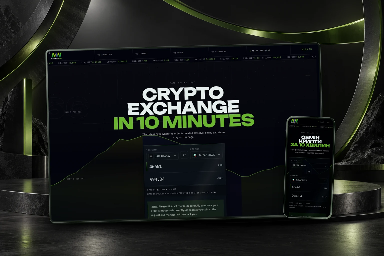
Amount, currency and direction sit together in the exchange form. The main action is visible before the visitor needs to read the rest of the page.
01 / The idea
An exchange website has to make important information easy to find. The redesign brings the exchange form, direction selection and service information into a coherent interface, with the same visual language across public pages.
Large typography gives the brand a distinct first impression. Compact controls and a consistent content structure let returning visitors get straight to the task. The frontend connects to the existing exchange service.
02 / In motion
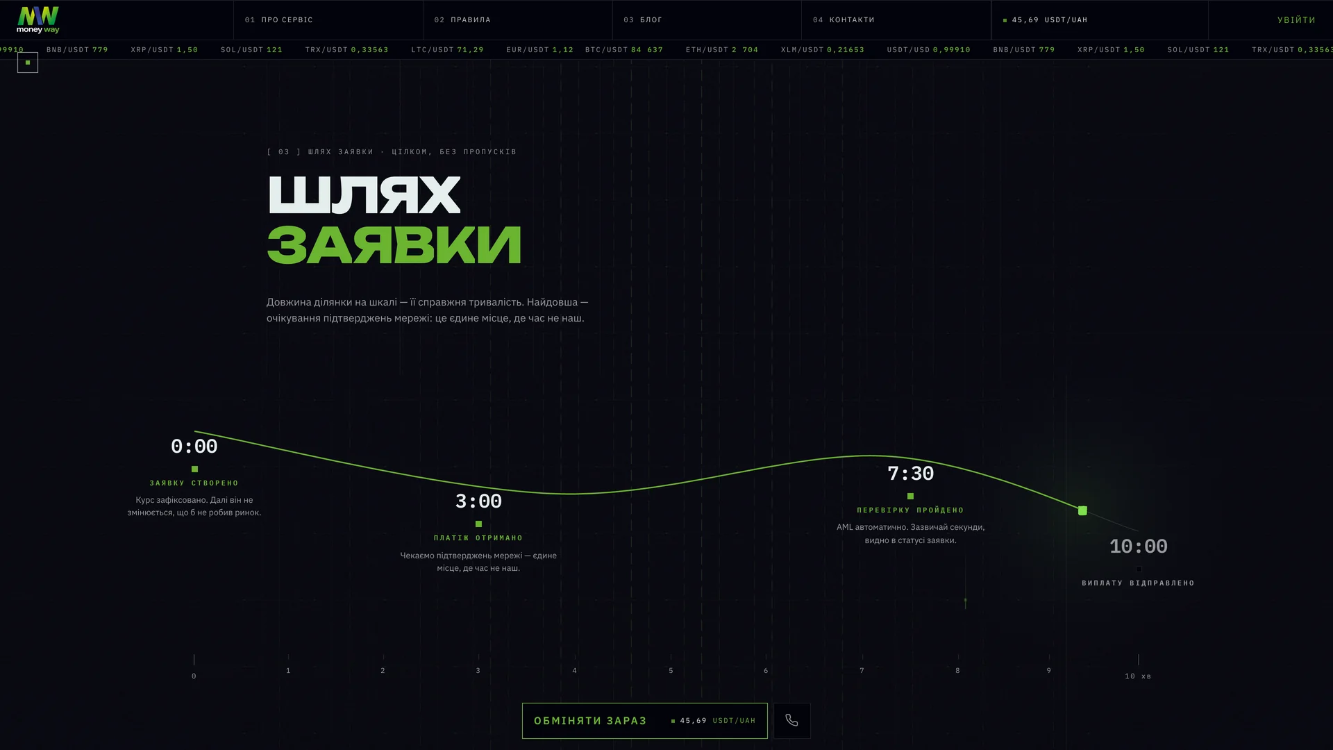
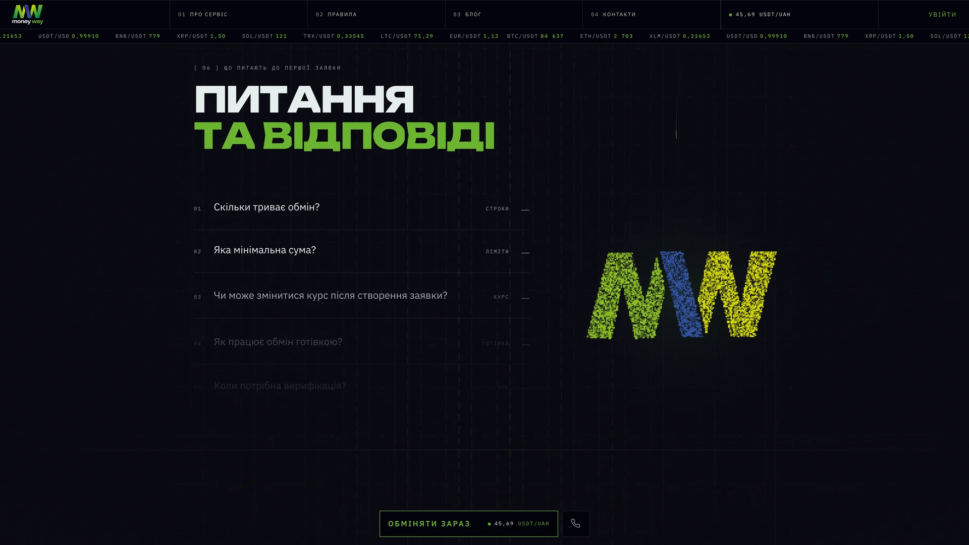
The particle mark, the exchange timeline and the currency selector. Three moments from the working website.
03 / The experience
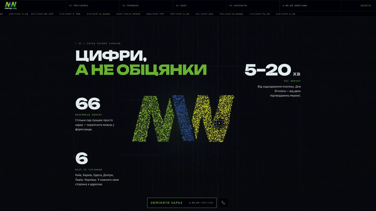
The exchange form comes first. The same visual language then explains the process, gives the service a recognizable identity and keeps supporting information close.
04 / Design decisions
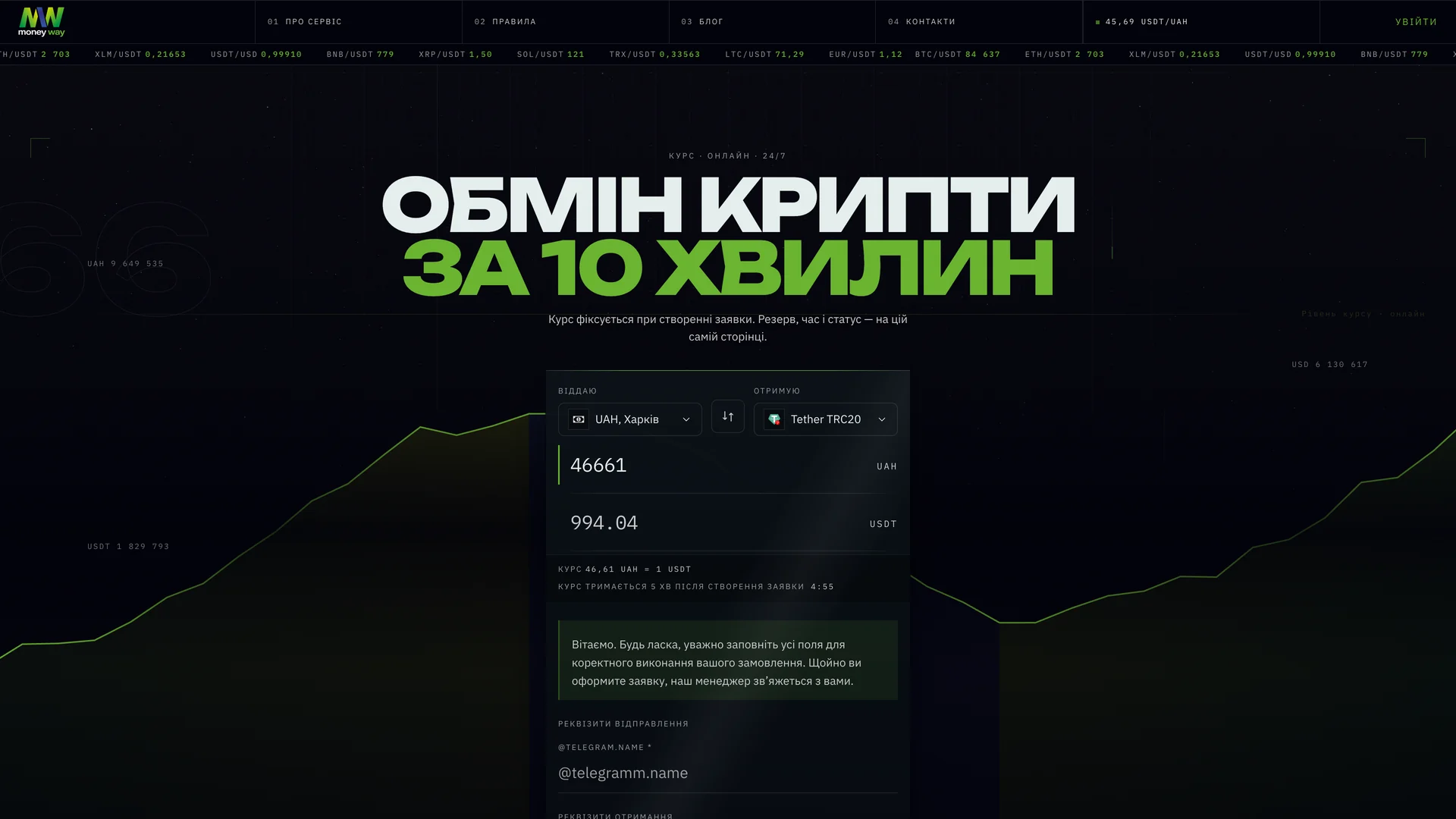
Amount, currency and direction sit together in the exchange form. The main action is visible before the visitor needs to read the rest of the page.
A drawn path connects the stages of a request. The animation introduces the process in order, with labels that remain available to read.
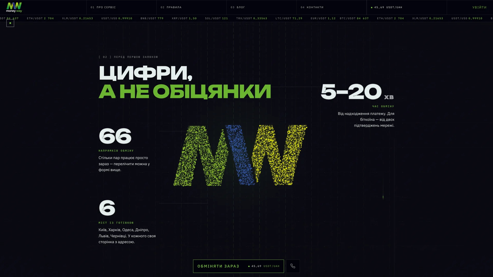
The MW mark assembles from particles in the brand sections. Practical controls and service information use a calmer, consistent layout.
05 / The mobile experience
The mobile layout stacks the exchange controls into a clear reading order. Amounts and currency selection stay together; supporting information follows below.

Website design and frontend development. Core exchange operations are provided by the existing exchange service. Recordings show the Ukrainian interface; displayed amounts are part of the captured website.
Cover: actual desktop and mobile interface captures composed over an AI-generated background scene. Interface images and films: supplied recordings of the website, selected and edited for this case.