One material language
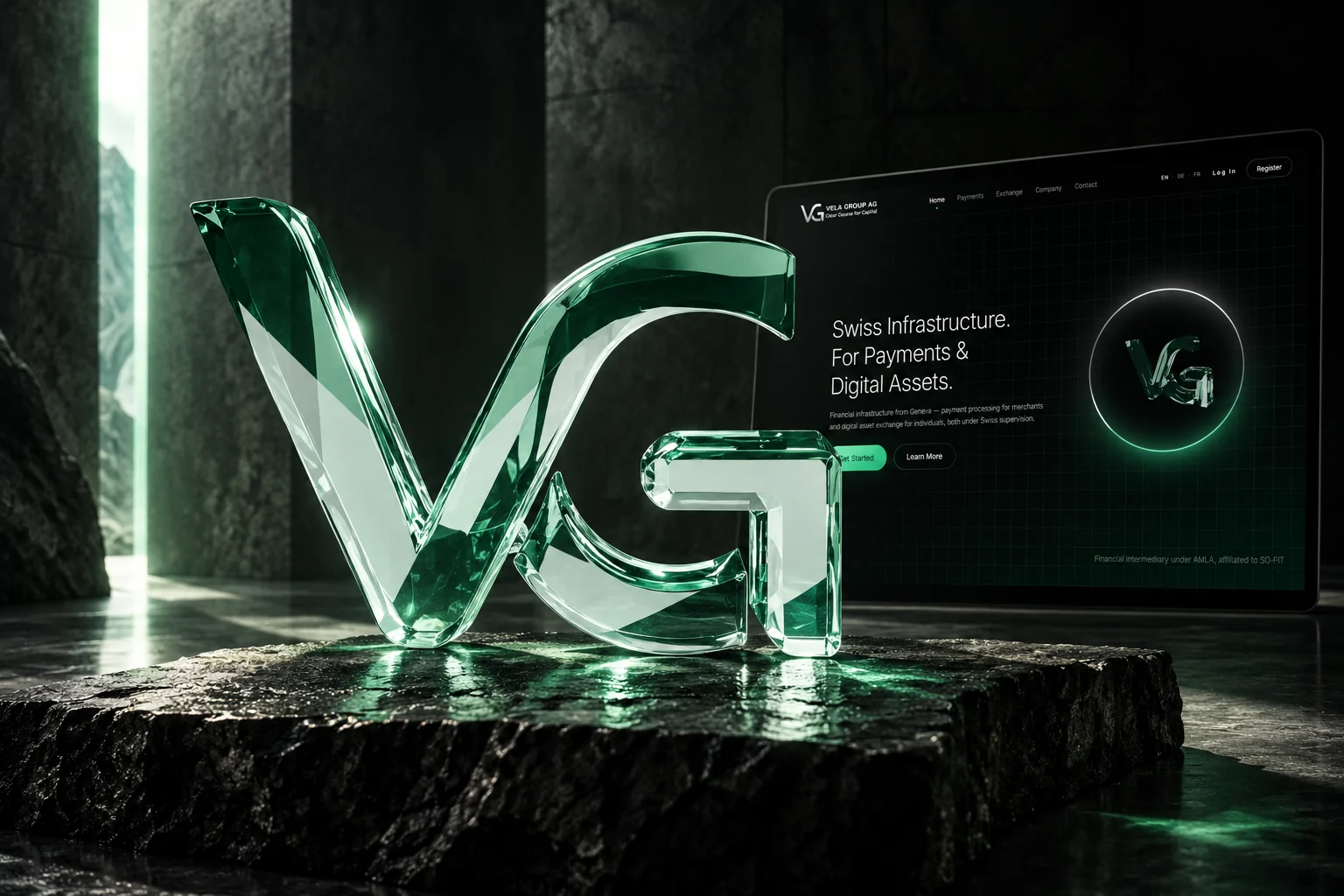
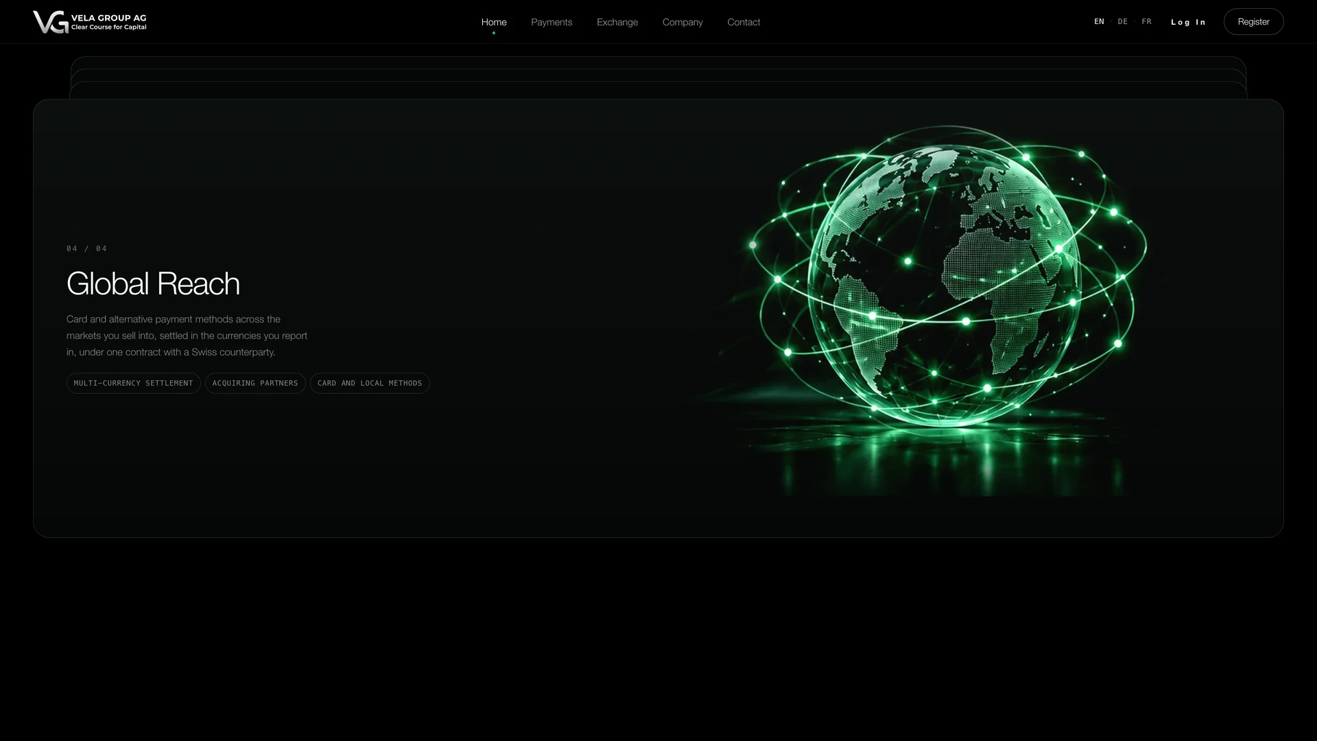
The monogram, service objects and globe share the same glass, light and dark surroundings. The identity stays recognizable as the subject changes.
01 / The idea
A financial-services website needs to make a complex offer easy to navigate. The design separates payments and exchange into two clear paths, tied together by a precise grid, restrained typography and a dimensional monogram.
Dark surfaces and controlled green light give the site a consistent character. The same structure carries through service pages, company information and contact. Vela is the fictional brand used for this portfolio edition.
02 / In motion
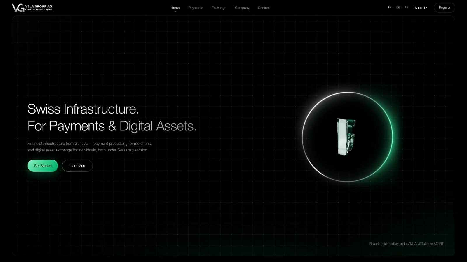
A rotating monogram introduces a family of glass objects. The material language carries from the first impression into the service pages.
03 / The experience
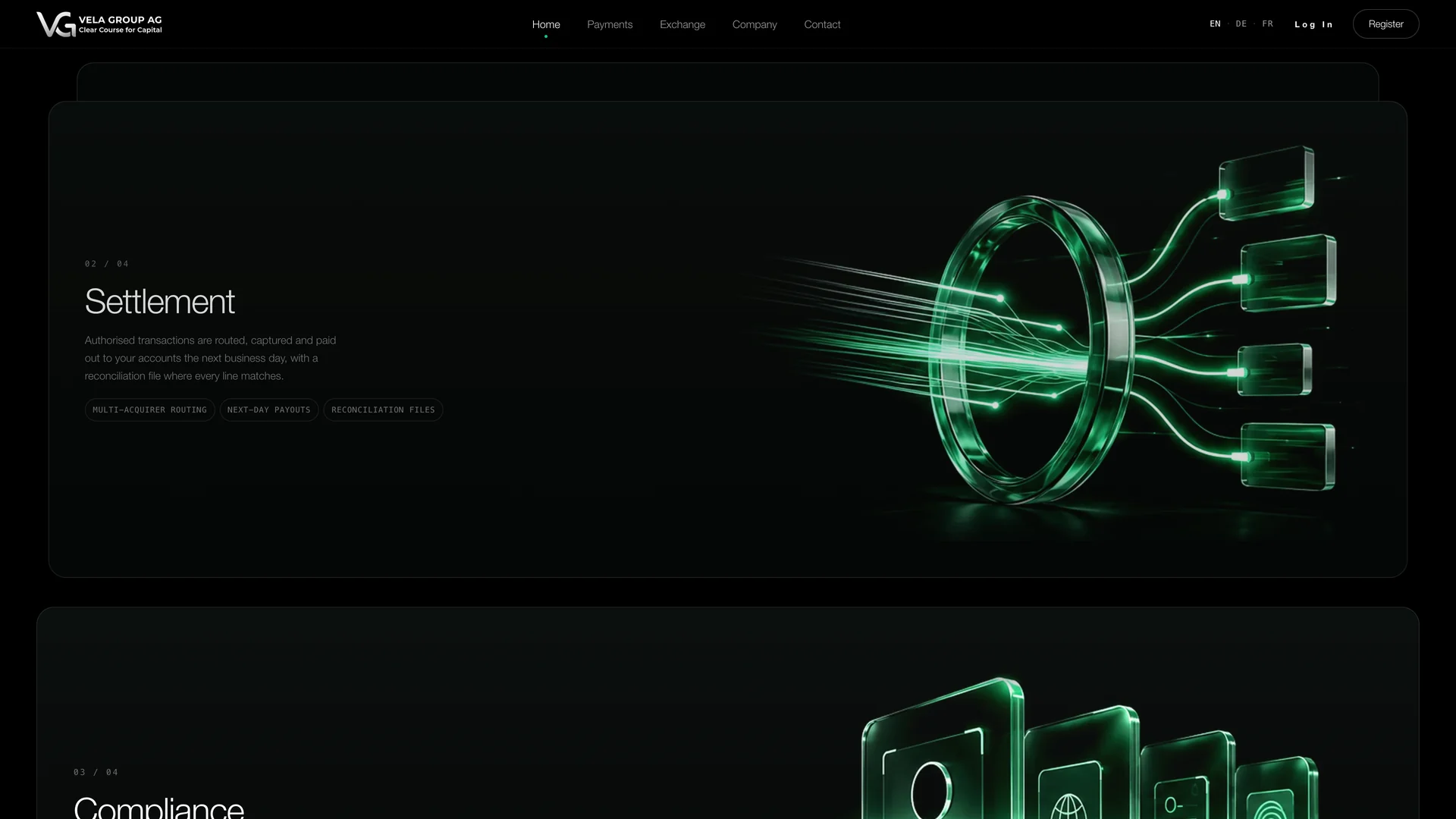
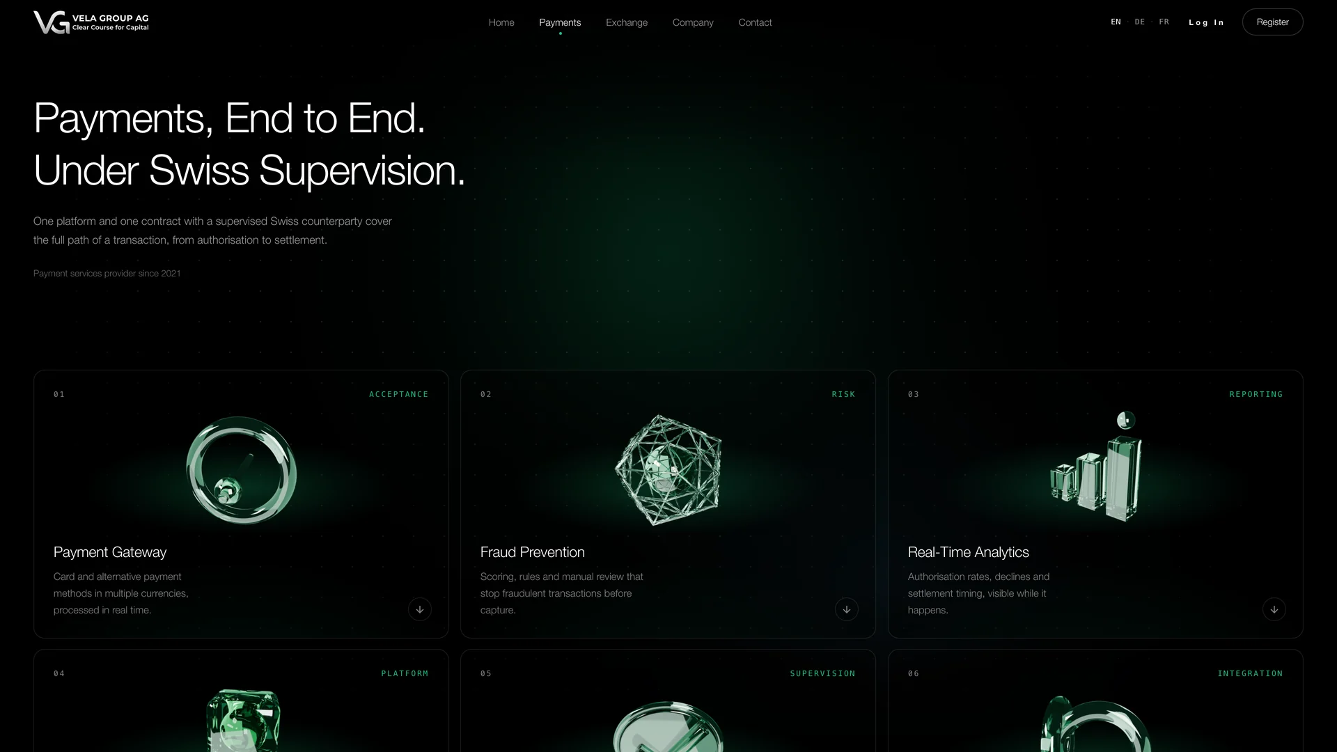
Light, glass and a precise grid connect the pages. Each object gives a service its own visual cue while remaining part of the same family.
04 / Design decisions
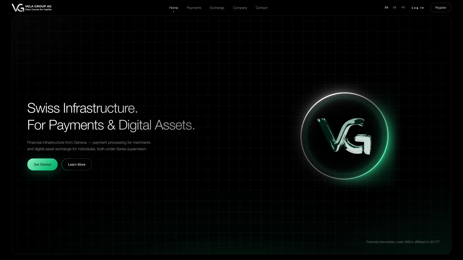
The monogram, service objects and globe share the same glass, light and dark surroundings. The identity stays recognizable as the subject changes.
Payments and exchange have dedicated pages. Consistent navigation and section hierarchy help visitors move from the overview into the relevant service.
The objects supply movement while headings and descriptions hold their position. The visual interest supports a stable reading experience.
05 / The mobile experience
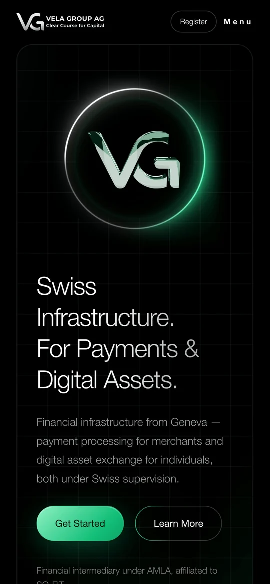
The mobile first screen brings the monogram and headline into a vertical composition. The same light, material and typography carry through the smaller view.
Portfolio edition presented under the fictional Vela Group AG brand. No financial services are offered by this concept. The case concerns website design and development; it makes no claims about a real firm’s regulatory status. Interface screenshots from the linked edition.
Cover: AI-generated presentation based on the project. Interface images and films: supplied recordings of the website, selected and edited for this case.