Connect the image to the product
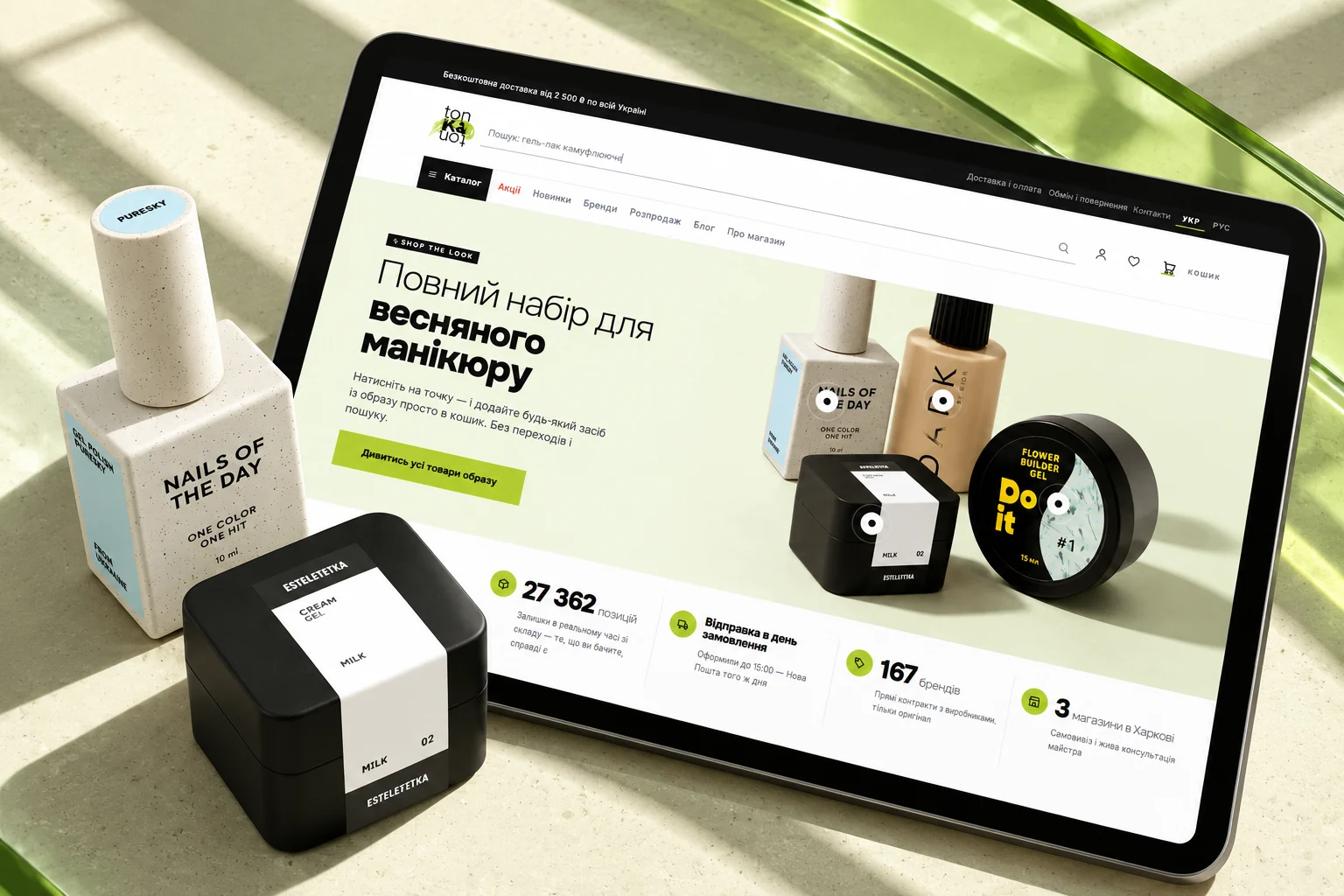
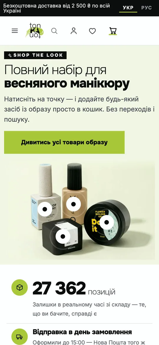
Hotspots turn the campaign banner into a direct route to the featured items. The visual story remains connected to the catalog.
01 / The idea
A store for beauty professionals has to work at two speeds: inspiration for a new look, and a direct route to the right product. tonKAton brings both into one shopping experience.
A shoppable opening introduces a complete look. Categories, product cards and dedicated brand pages then make a broad assortment easier to explore. The visual system pairs light surfaces and large product images with a fresh green accent.
02 / In motion
Shop products directly from the campaign banner, browse the color catalog and inspect an individual product. Recorded from the storefront preview.
03 / The experience
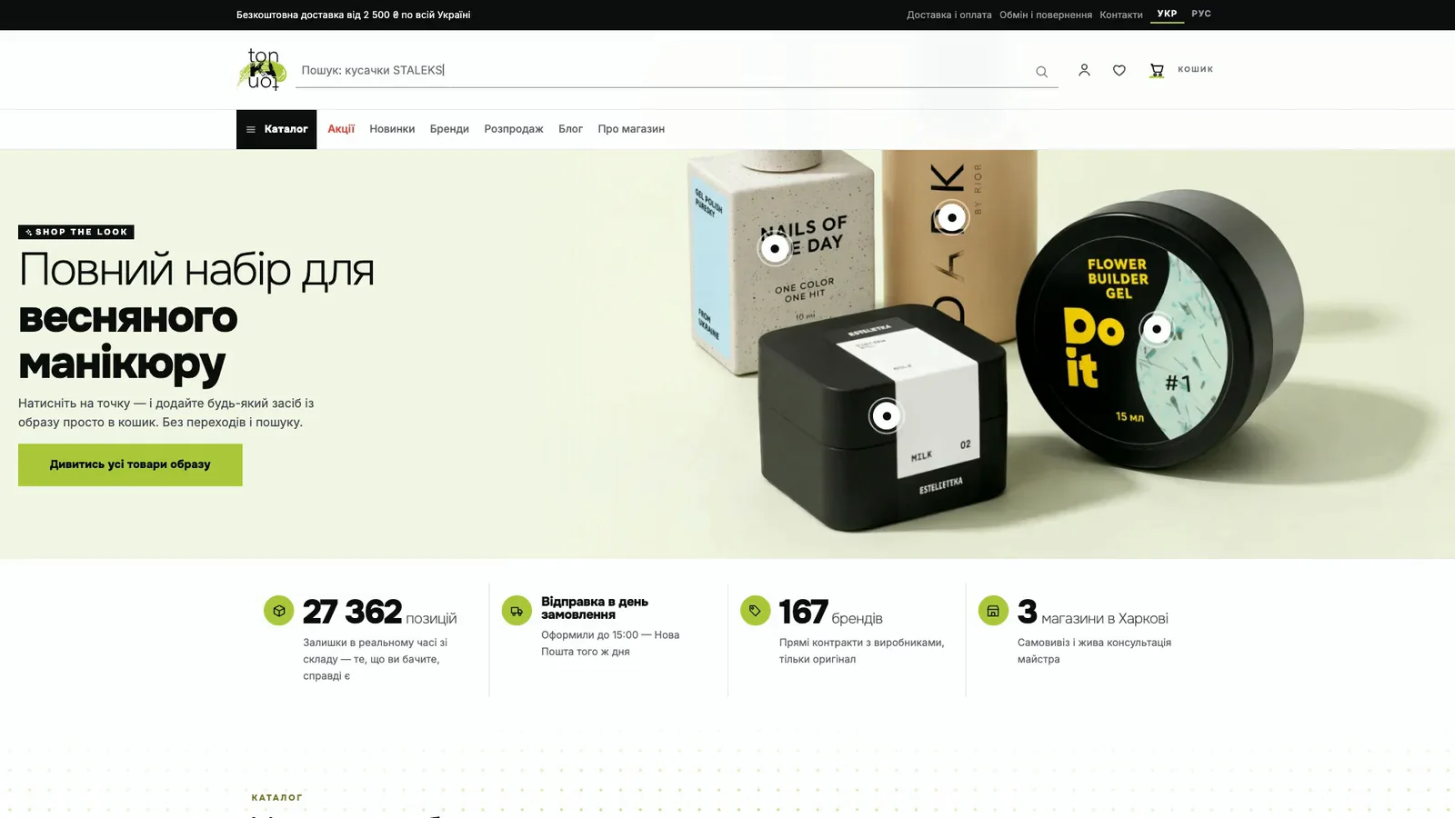
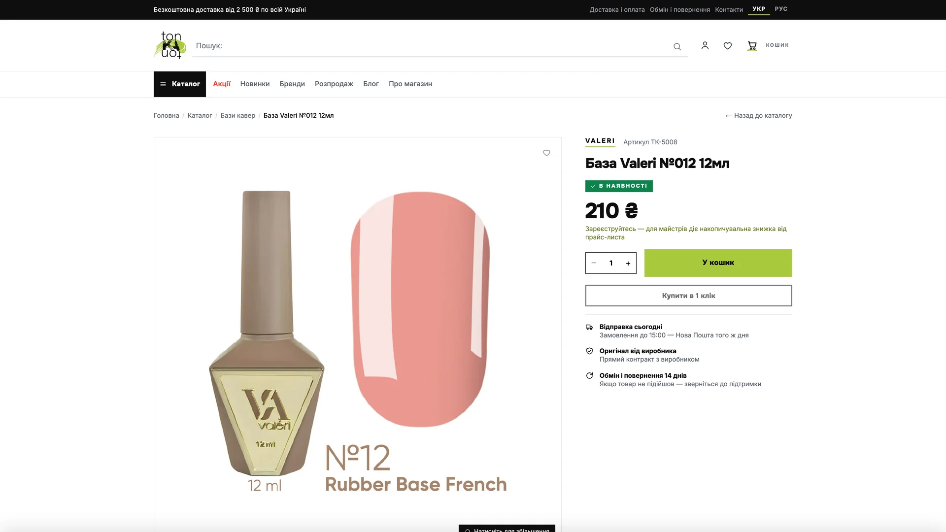
A product-led banner introduces the collection. The catalog and product page carry that first impression into a practical shopping journey.
04 / Design decisions
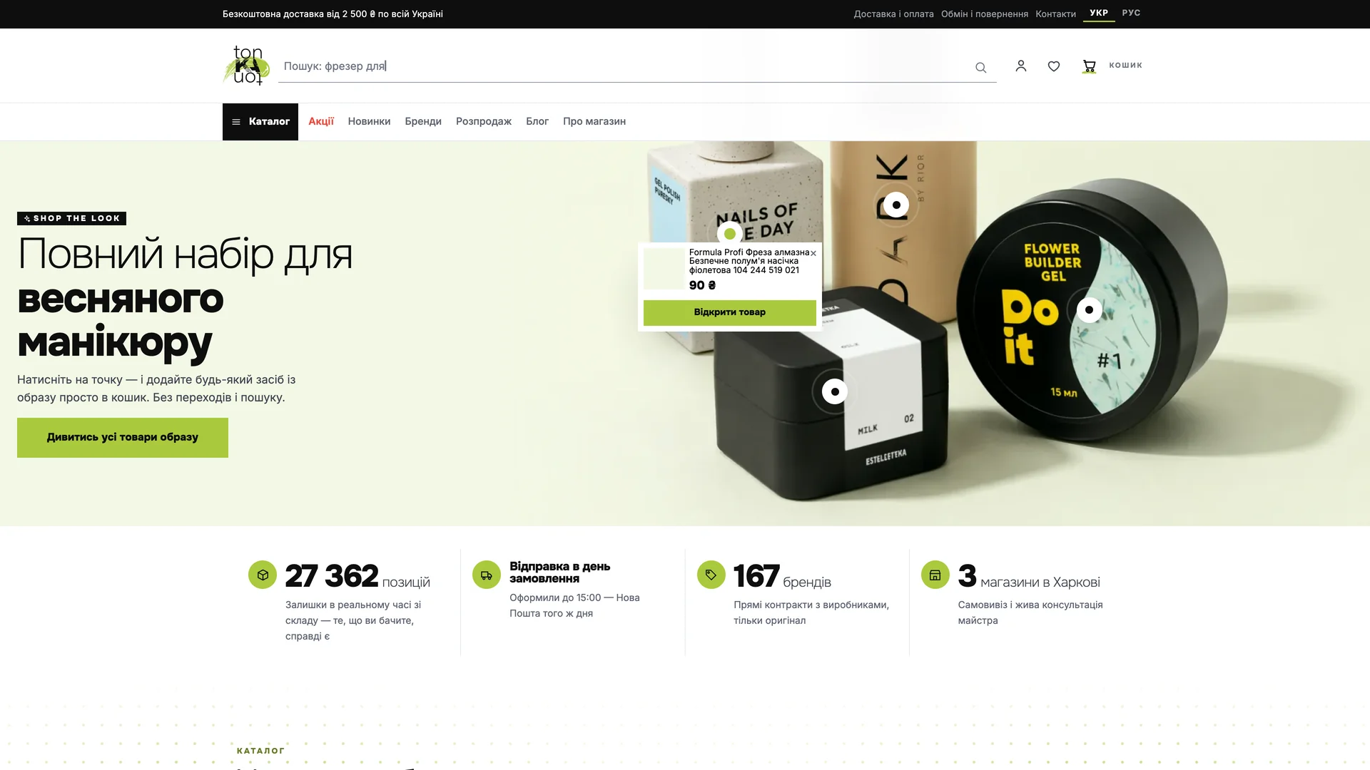
Hotspots turn the campaign banner into a direct route to the featured items. The visual story remains connected to the catalog.
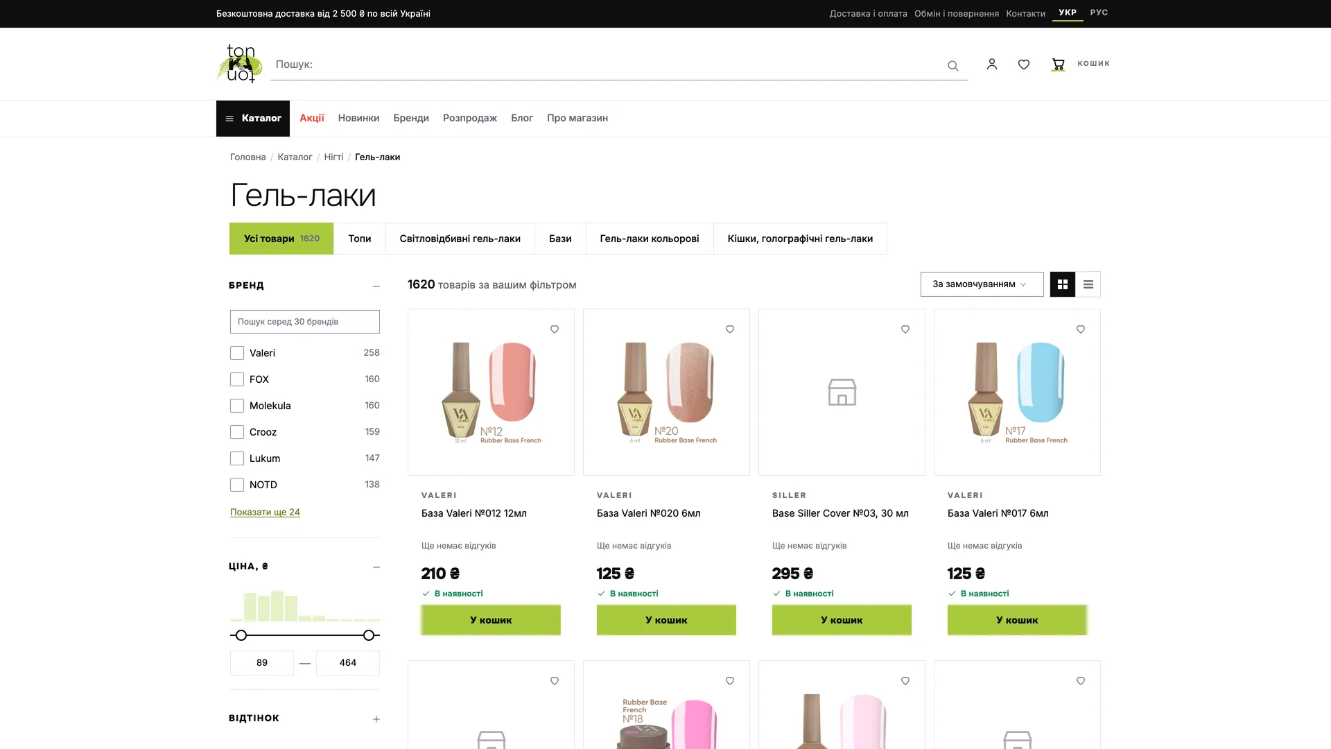
Category and brand navigation give different ways to enter the collection. Product imagery keeps color and packaging easy to recognize.
Brand pages and editorial guides sit beside the products. The store can support discovery as well as repeat visits for familiar essentials.
05 / The mobile experience
The campaign banner keeps its product hotspots on a phone. The collection continues below in a responsive grid.
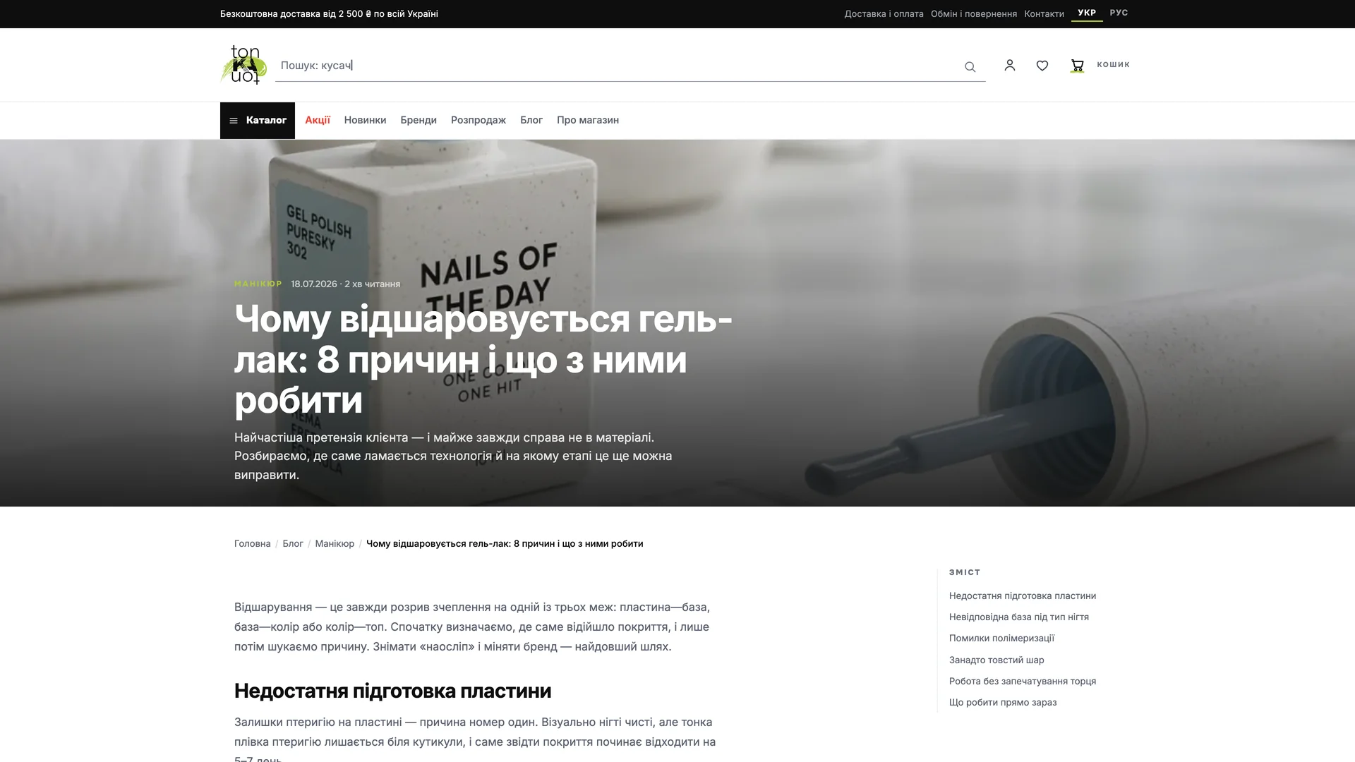
Ecommerce storefront / Development preview. Images show the actual storefront and its existing product artwork. Product names and marks belong to their respective owners. Screenshots are presentation examples, not current price or stock information.
Cover: AI-generated presentation based on the project. Interface images and films: supplied recordings, selected and edited for this case.